

Flexbox
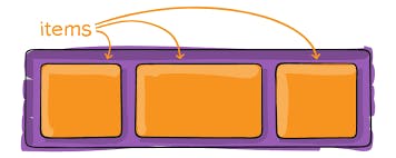
The Flexbox Layout module aims at providing a more efficient way to lay out, align and distribute space among items in a container, even when their size is unknown and/or dynamic.
The main idea behind the flex layout is to give the container the ability to alter its items’ width/height (and order) to best fill the available space (mostly to accommodate all kinds of display devices and screen sizes). A flex container expands items to fill available free space or shrinks them to prevent overflow.
Flexbox properties
1. Properties for the Parent (flex container)
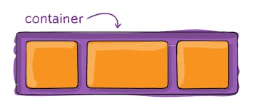
This defines a flex container; inline or block depending on the given value. It enables a flex context for all its direct children.
.container {
  display: flex; /* or inline-flex */
}
Flex-direction
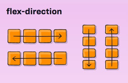
This establishes the main axis, thus defining the direction flex items are placed in the flex container. Flexbox is (aside from optional wrapping) a single-direction layout concept. Think of flex items as primarily laying out either in horizontal rows or vertical columns.
.container {
  flex-direction: row | row-reverse | column | column-reverse;
}
row (default): left to right in ltr; right to left in rtl
row-reverse: right to left in ltr; left to right in rtl
column: same as row but top to bottom
column-reverse: same as row-reverse but bottom to top
Flex-wrap
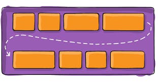
By default, flex items will all try to fit onto one line. You can change that and allow the items to wrap as needed with this property.
.container {
  flex-wrap: nowrap | wrap | wrap-reverse;
}
nowrap (default): all flex items will be on one line
wrap: flex items will wrap onto multiple lines, from top to bottom.
wrap-reverse: flex items will wrap onto multiple lines from bottom to top.
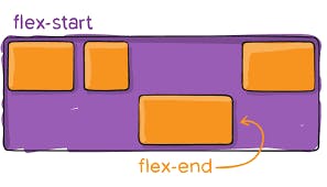
justify-content
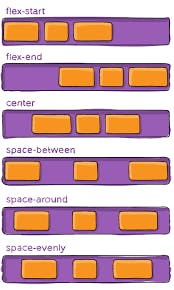
This defines the alignment along the main axis. It helps distribute extra free space leftover when either all the flex items on a line are inflexible, or are flexible but have reached their maximum size. It also exerts some control over the alignment of items when they overflow the line.
.container {
  justify-content: flex-start | flex-end | center | space-between | space-around
    | space-evenly | start | end | left | right... + safe | unsafe;
}
flex-start (default): items are packed toward the start of the flex-direction. flex-end: items are packed toward the end of the flex direction.
start: items are packed toward the start of the writing-mode direction. end: items are packed toward the end of the writing-mode direction.
left: items are packed toward the left edge of the container unless that doesn’t make sense with the flex-direction, then it behaves like the start.
right: items are packed toward the right edge of the container, unless that doesn’t make sense with the flex-direction, then it behaves like a start.
center: items are centered along the line
space-between: items are evenly distributed in the line; the first item is on the start line, the last item on the end line
space-around: items are evenly distributed in the line with equal space around them.
space-evenly: items are distributed so that the spacing between any two items (and the space to the edges) is equal.
align-items
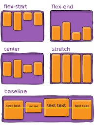
This defines the default behavior for how flex items are laid out along the cross axis on the current line. Think of it as the justify-content version for the cross-axis (perpendicular to the main axis).
.container {
  align-items: stretch | flex-start | flex-end | center | baseline | first
    baseline | last baseline | start | end | self-start | self-end +... safe |
    unsafe;
}
stretch (default): stretch to fill the container (still respect min-width/max-width)
flex-start / start / self-start: items are placed at the start of the cross axis.
flex-end / end / self-end: items are placed at the end of the cross axis.
center: items are centered in the cross-axis
baseline: items are aligned such as their baselines align
align-content
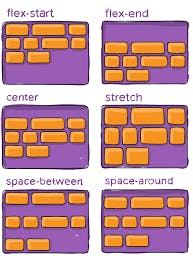
This aligns a flex container’s lines when there is extra space in the cross-axis, similar to how justify-content aligns individual items within the main axis.
.container {
  align-content: flex-start | flex-end | center | space-between | space-around |
    space-evenly | stretch | start | end | baseline | first baseline | last
    baseline +... safe | unsafe;
}
normal (default): items are packed in their default position as if no value was set.
flex-start / start: items packed to the start of the container. The (more supported)
flex-end / end: items packed to the end of the container. The (more support) flex-end honors the flex direction while the end honors the writing-mode direction.
center: items centered in the container space-between: items evenly distributed; the first line is at the start of the container while the last one is at the end
space-around: items evenly distributed with equal space around each line
space-evenly: items are evenly distributed with equal space around them
stretch: lines stretch to take up the remaining space
gap, row-gap, column-gap
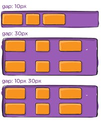
The gap property explicitly controls the space between flex items. It applies that spacing only between items not on the outer edges.
.container {
  display: flex;
  ...
  gap: 10px;
  gap: 10px 20px; /* row-gap column gap */
  row-gap: 10px;
  column-gap: 20px;
}
It is not exclusively for flexbox, gap works in the grid and multi-column layouts as well.
2. Properties for the Children (flex items)
order
By default, flex items are laid out in the source order. However, the order property controls the order in which they appear in the flex container.
.item {
  order: 5; /* default is 0 */
}
flex-grow
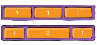
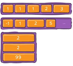
This defines the ability for a flex item to grow if necessary. It accepts a unitless value that serves as a proportion. It dictates what amount of the available space inside the flex container the item should take up.
If all items have flex-grow set to 1, the remaining space in the container will be distributed equally to all children. If one of the children has a value of 2, that child would take up twice as much of the space as either one of the others (or it will try, at least).
.item {
  flex-grow: 4; /* default 0 */
}
flex-shrink
This defines the ability of a flex item to shrink if necessary.
.item {
  flex-shrink: 3; /* default 1 */
}
flex
This is the shorthand for flex-grow, flex-shrink and flex-basis combined. The second and third parameters (flex-shrink and flex-basis) are optional. The default is 0 1 auto, but if you set it with a single number value, like flex: 5; that changes the flex-basis to 0%, so it’s like setting flex-grow: 5; flex-shrink: 1; flex-basis: 0%;.
.item {
  flex: none | [ < "flex-grow" > < "flex-shrink" >? || < "flex-basis" > ];
}
align-self
This allows the default alignment (or the one specified by align-items) to be overridden for individual flex items.
Please see the align-items explanation to understand the available values.
.item {
  align-self: auto | flex-start | flex-end | center | baseline | stretch;
}